Population Boom: Charting How We Got to Nearly 8 Billion People
by Jeff Desjardins via Visual Capitalist
Today, the global population is estimated to sit at 7.91 billion people.
By the end of 2022 or within the first months of 2023, that number is expected to officially cross the 8 billion mark. Incredibly, each new billion people has come faster than the previous—it was roughly only a decade ago that we crossed the 7 billion threshold.
How did we get here, and what has global population growth looked like historically?
In this series of six charts from Our World in Data, we’ll break down how the global population got to its current point, as well as some big picture trends behind the data.
#1: Mapping the Population Over 5,000 Years
New York, São Paulo, and Jakarta were not always bustling metropolises. In fact, for long parts of the history of civilization, it was unusual to find humans congregating in many of the present-day city locations we now think of as population centers.
The human population has always moved around, seeking out new opportunity and freedoms.
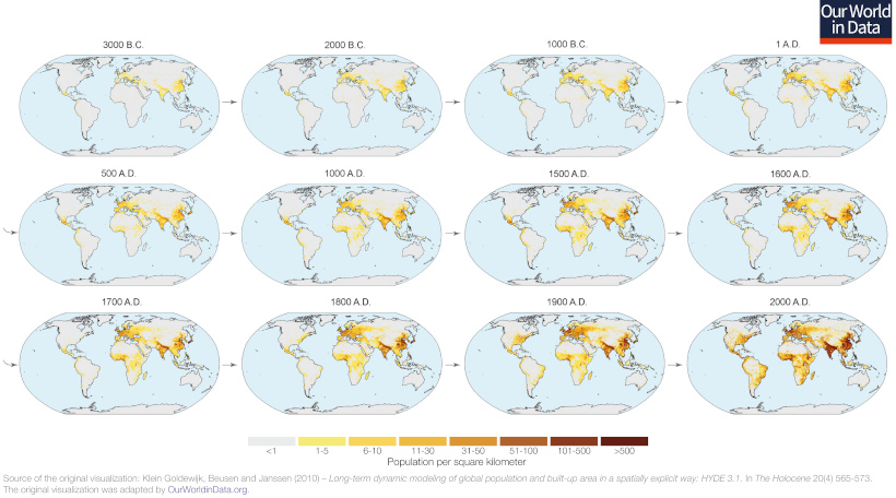
As of 3,000 BC, humans could be mainly found in Central America, the Mediterranean, the Fertile Crescent, and parts of India, Japan, and China. It’s no coincidence that that agriculture was independently discovered in many of these same places during the Neolithic Revolution.
#2: The Hockey Stick Curve
For even more context, let’s zoom way out by using a timeline that goes back to when woolly mammoths still roamed the Earth:
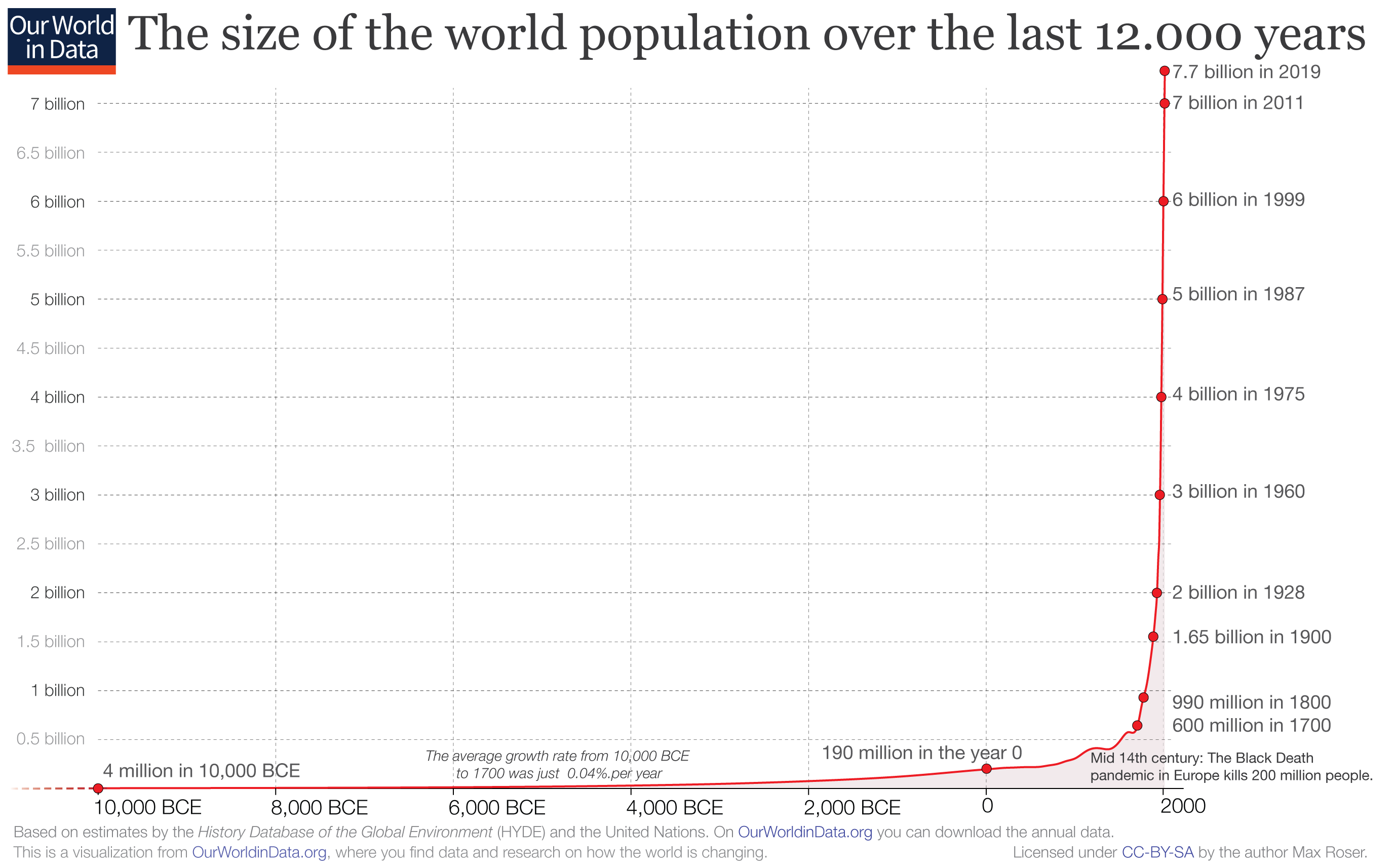
From this 10,000-foot view, it’s clear that human population growth started going exponential around the time of the Second Agricultural Revolution, which started in the 17th century in Britain. This is when new technologies and farming conventions took root, making it possible to grow the food supply at an unprecedented pace.
Soon these discoveries spread around the world, enabling population booms everywhere.
#3: The Time to Add 1 Billion
The data and projections in this chart are a few years old, but the concept remains the same:
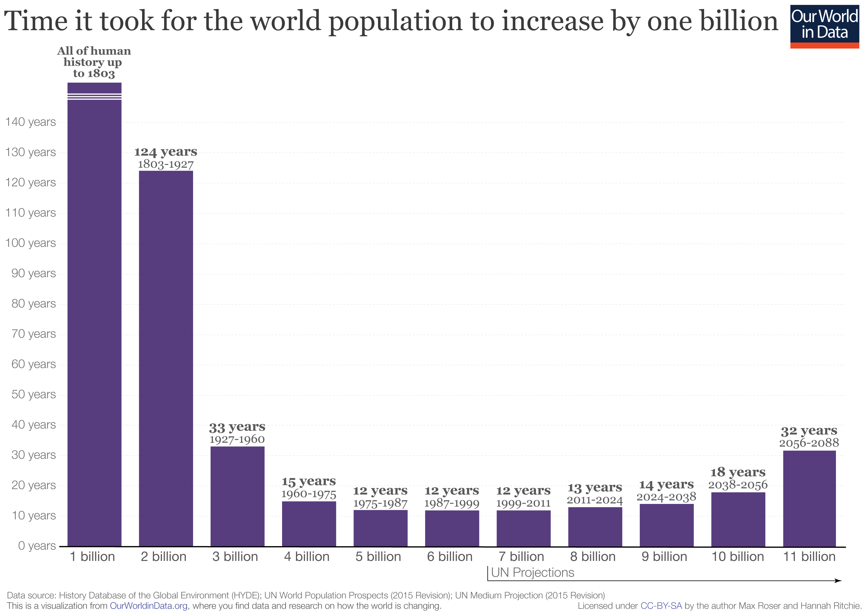
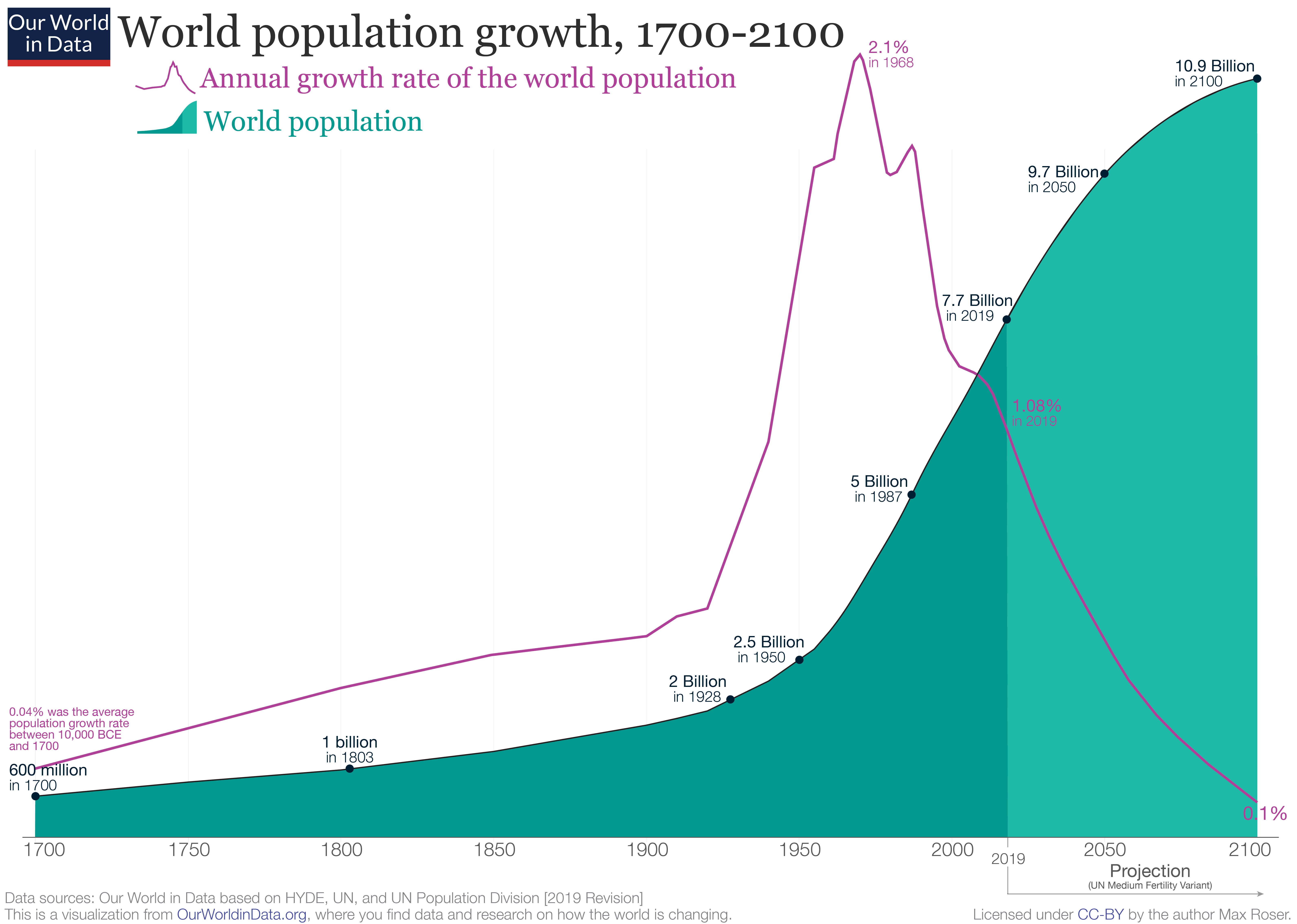
It took all of human history until 1803 to reach the first billion in population. The next billion took 124 years, and the next 33 years. More recent billions have come every dozen or so.
So why then, are future billion people additions projected to take longer and longer to achieve?
#4: The Growth Rate is Shrinking
Because of demographics and falling fertility rates, the growth rate of the global population has actually been on a downward trend for some time.
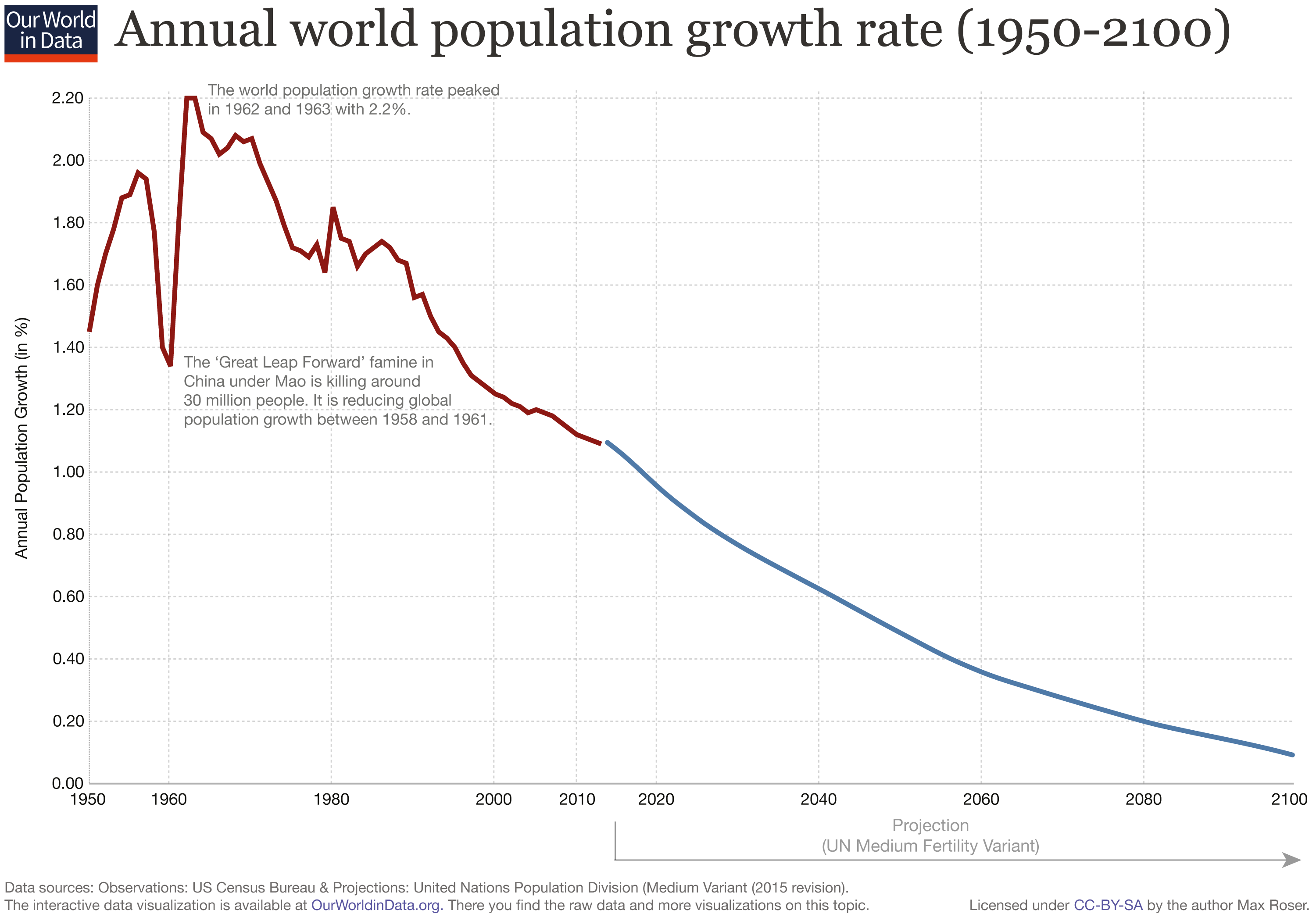
As this growth rate gets closer to zero, the population curve has become less exponential like we saw in the first graphs. Population growth is leveling out, and it may even go negative at some point in the future.
#5: The Regional Breakdown
Although the rate of population growth is expected to slow down, there are still parts of the world that are adding new people fast, as you can see on this interactive regional breakdown:
Since 1973, Asia has doubled its population from 2.3 billion to 4.6 billion people.
Comparatively, over the same time frame, Europe has gone from 670 million to 748 million, equal to just an 11% increase.
#6: The Present and Future of Population Growth
Population projections by groups like the United Nations see the global population peaking at around 10.9 billion people in 2100.
That said, there isn’t a consensus around this peak.
Organizations like the Institute for Health Metrics and Evaluation (IHME) have a different perspective, and they have recently modeled that the global population will top out at 9.7 billion people by the year 2064.
As we climb to surpass the 8 billion mark in the coming months, it will be interesting to see what path humanity ends up following.
Source Data: Our Word in Data
Reprinted with permission of Visual Capitalist.